How to create list sections with animated shapes


Welcome to Composable fun, a place where I will share tutorials, hints, dos and don'ts, learnings, new developments but also questions I encounter on the subject of Jetpack Compose. I'll try to let the code and visuals speak, with me filling in the gaps. So let's start right into it!
For this tutorial I'll show you how you can achieve the following:
Hi #Androiddev 👋! Wondering whether I should start to write about stuff I do. Would any of you want to read about how to do something like this with #jetpackCompose? pic.twitter.com/Pu2j6GKBbh
— Konstantin Klassen (@Snokbert) October 21, 2023
We see a simple todo list that keeps unchecked items at the top and moves checked items to the bottom. Checked and unchecked items are visually grouped and separated by a header. Corner sizes animate when items change position. How would we approach something like this? I suggest following order:
- Define a model
- Render the fully functional list without animations
- Polish the list by adding animations
Model
Let's start by modelling what we want to render. We might have to take another look at the list for that:
It looks like there are two main actors here: Todo items and their visual representation as ListElements.
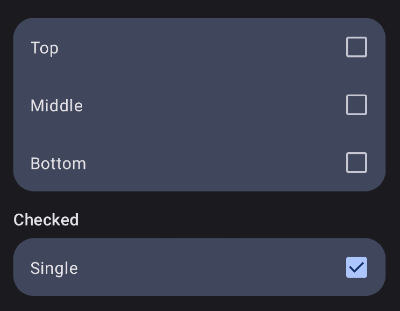
Todo: Raw data, or: what should be rendered? Name and checked state in this simple caseListElement: How should the items be rendered? Here we're talking about the background shapes. There are 4 different shapes that a list item can take which is determined by something we call aRole. These roles are:- Top: Top corners are rounded
- Middle: No corners are rounded
- Bottom: Bottom corner are rounded
- Single: All corner are rounded
Apparently a ListElement can also be a Header, so that should also be included in the resulting model, which might turn out like this:
data class Todo(
    val id: String = UUID.randomUUID().toString(),
    val text: String,
    val isChecked: Boolean,
)

sealed interface ListElement {
    val id: String

    data class Header(
        val text: String
    ) : ListElement {
        override val id = text
    }

    data class Item(
        val todo: Todo,
        val role: Role
    ) : ListElement {
        override val id = todo.id
    }

    enum class Role {
        TOP, BOTTOM, MIDDLE, SINGLE
    }
}
With that in place, the last step needed is to map a list of Todos to a list of ListElements which then can be fed to a LazyColumn. This can be achieved in many ways. I decided to make this step very explicit by adding an intermediate representation of the data as Sections, which makes it easier to derive the correct Role for each item. Each Section holds a list of Todos and an optional header. Here is the code:
data class Section(
    val header: String?,
    private val todos: List<Todo>
) {
    val todosWithRoles = todos.associateWith { todo ->
        when {
            todos.size == 1 -> SINGLE
            todos.indexOf(todo) == 0 -> TOP
            todos.indexOf(todo) == todos.size - 1 -> BOTTOM
            else -> MIDDLE
        }
    }
}

private fun List<Todo>.toSections(): List<Section> {
    val (checkedTodos, uncheckedTodos) = partition { it.isChecked }
    return buildList {
        add(Section(null, uncheckedTodos))

        if (checkedTodos.isNotEmpty()) {
            add(Section("Checked", checkedTodos))
        }
    }
}

private fun List<Section>.toListElements() = map { section ->
    buildList {
        section.header?.let {
            add(ListElement.Header(it))
        }
        section.todosWithRoles.forEach { (todo, role) ->
            add(ListElement.Item(todo, role))
        }
    }
}.flatten()
Okay, now we can finally create a bunch of Todo items, which are mapped to their LazyColumn-consumable form on every change:
val todos = remember {
    mutableStateListOf(
        Todo(text = "Foo", isChecked = false),
        Todo(text = "Bar", isChecked = false),
        Todo(text = "Bauz", isChecked = false),
        Todo(text = "Baz", isChecked = false),
    )
}

val listItems = todos.toSections().toListElements()
Render the list
It's time to feed the listItems to a LazyColumn:
LazyColumn(
    contentPadding = PaddingValues(vertical = 16.dp),
) {
    items(
        items = listItems,
        key = { it.id },
    ) {
        when (it) {
            is ListElement.Header -> HeaderItem(
                text = it,
            )

            is ListElement.Item -> TodoItem(
                todo = it,
            ) { clickedId ->
                val index = todos.indexOf(todos.find { it.id == clickedId })
                if (index >= 0) {
                    todos[index] = todos[index].copy(isChecked = !todos[index].isChecked)
                }
            }
        }
    }
}
ListElement.Header is rendered as a HeaderItem and ListElement.Item is rendered as a TodoItem. If a TodoItem is clicked, its corresponding Todo checked state is flipped.
Let's have a look at HeaderItem and TodoItem:
@Composable
fun HeaderItem(text: ListElement.Header, modifier: Modifier = Modifier) {
    Text(
        modifier = modifier
            .padding(horizontal = 16.dp)
            .padding(top = 16.dp, bottom = 8.dp),
        text = text.text,
        style = MaterialTheme.typography.titleMedium
    )
}

@Composable
fun TodoItem(
    todoItem: ListElement.Item,
    modifier: Modifier = Modifier,
    outerCornerSize: Dp = 20.dp,
    innerCornerSize: Dp = 0.dp,
    onClick: (String) -> Unit
) {
    val shape = todoItem.role.toShape(outerCornerSize, innerCornerSize)

    Card(
        modifier = modifier
            .padding(horizontal = 16.dp)
            .fillMaxWidth(),
        shape = shape,
        onClick = { onClick(todoItem.todo.id) }
    ) {
        Row(
            modifier = Modifier
                .heightIn(min = 56.dp)
                .padding(horizontal = 16.dp),
            verticalAlignment = Alignment.CenterVertically
        ) {
            Text(
                modifier = Modifier.weight(1f),
                text = todoItem.todo.text,
                style = MaterialTheme.typography.bodyLarge,
            )
            Checkbox(checked = todoItem.todo.isChecked, onCheckedChange = null)
        }
    }
}

private fun ListElement.Role.toShape(outerCornerSize: Dp, innerCornerSize: Dp) = when (this) {
    TOP -> RoundedCornerShape(topStart = outerCornerSize, topEnd = outerCornerSize, bottomStart = innerCornerSize, bottomEnd = innerCornerSize)
    BOTTOM -> RoundedCornerShape(topStart = innerCornerSize, topEnd = innerCornerSize, bottomStart = outerCornerSize, bottomEnd = outerCornerSize)
    MIDDLE -> RoundedCornerShape(innerCornerSize)
    SINGLE -> RoundedCornerShape(outerCornerSize)
}
The most interesting part can be found at the bottom: The toShape method takes an outerCornerSize and innerCornerSize (where innerCornerSize is 0.dp for now) and creates the right RoundedCornerShape based on the provided Role which is then used to set the shape of the Card. This is what we have so far:
Not bad, all items use the right shape. Without animations however, I have no idea what's going on. It's time for some 🪄.
Animations
Low hanging fruits first! With Modifier.animateItemPlacement() items in a LazyColumn animate to their target location when their position in the list changes. HeaderItem and TodoItem both take Modifier as an argument. You know what to do!
...
HeaderItem(
    modifier = Modifier.animateItemPlacement(),
    text = it
)
...
and
...
TodoItem(
  modifier = Modifier.animateItemPlacement(),
  todoItem = it,
)
...Way better! The only thing missing is animating the RoundedCornerShape. For that we have to adapt the ListElement.Role.toShape() method that we defined above. Don't scroll up, here it is again:
private fun ListElement.Role.toShape(outerCornerSize: Dp, innerCornerSize: Dp) = when (this) {
    TOP -> RoundedCornerShape(topStart = outerCornerSize, topEnd = outerCornerSize, bottomStart = innerCornerSize, bottomEnd = innerCornerSize)
    BOTTOM -> RoundedCornerShape(topStart = innerCornerSize, topEnd = innerCornerSize, bottomStart = outerCornerSize, bottomEnd = outerCornerSize)
    MIDDLE -> RoundedCornerShape(innerCornerSize)
    SINGLE -> RoundedCornerShape(outerCornerSize)
}
After some changes, it becomes:
@Composable
private fun ListElement.Role.toShape(outerCornerSize: Dp, innerCornerSize: Dp): Shape {
    val (outerCornerSizePx, innerCornerSizePx) = LocalDensity.current.run {
        outerCornerSize.toPx() to innerCornerSize.toPx()
    }

    val targetRect = remember(this, outerCornerSize, innerCornerSize) {
        when (this) {
            TOP -> Rect(outerCornerSizePx, outerCornerSizePx, innerCornerSizePx, innerCornerSizePx)
            BOTTOM -> Rect(innerCornerSizePx, innerCornerSizePx, outerCornerSizePx, outerCornerSizePx)
            MIDDLE -> Rect(innerCornerSizePx, innerCornerSizePx, innerCornerSizePx, innerCornerSizePx)
            SINGLE -> Rect(outerCornerSizePx, outerCornerSizePx, outerCornerSizePx, outerCornerSizePx)
        }
    }

    val animatedRect by animateRectAsState(targetRect)

    return RoundedCornerShape(
        animatedRect.left, animatedRect.top, animatedRect.right, animatedRect.bottom
    )
}
Let's break this down a little, shall we? You might notice that this method is now a @Composable which returns a RoundedCornerShape. We can assume that every time the shape changes, its observers get notified and thus can update their shape. But why do I work with Rect and only as the last step do I transform it to a RoundedCornerShape? Yeah... I cheated a little, but hold on, I can explain!
Compose provides us with an easy way to use value based animations: animate*AsState. Ideally there would be a animateRoundedCornerShapeAsState which unfortunatelly doesn't exist. However there is an animateRectAsState! We need to animate four corners, Rect offers four edges, that's good enough for me.
Since the corner sizes are provided as Dp, but Rect accepts only floats, we use LocalDensity to get the pixel values of the provided corner sizes. With these, the targetRect can be defined. Every time targetRect changes, which happens when any argument in remember(Role, outerCornerSizePx, innerCornerSizePx) changes, animatedRect changes direction and animates towards it. The current value of animatedRect is what is used to finally create the resulting RoundedCornerShape.
There you have it, list items with nicely animated corners:
Bonus: Animated gaps and inner corners
The video from the top not only shows animated outer corners, but also inner corners and gaps between todo items. We're already well prepared to add these things with just a few lines of code. We start with the gaps:
val spacedBy by animateDpAsState(targetValue)
...
LazyColumn(
    verticalArrangement = Arrangement.spacedBy(spacedBy)
)
That's it! Arrangement.spacedBy allows us to define the padding between list items in a LazyColumn. With help of our new friend animateDpAsState this padding can be smoothly animated. Animating the inner corners is as simple:
val innerCornerSize by animateDpAsState(targetValue)
...
TodoItem(
  innerCornerSize = innerCornerSize
)And we're done. I'll leave it up to you to decide how you want `targetValue` to be defined. In case you need some inspiration, I'll share the source code at the bottom of this tutorial.
Performance
Yes, you got me, this solution suffers from a slight case of recompositis. We can reduce the number of recompositions, but should we? By looking at the videos I provided I'd say we don't have to. These were taken from an unoptimized debug build. Code might become less readable if it's solely written to reduce the number of recompositions. So as long as we can't see issues, I'd say we shoudn't create any.
You're still here... Okay, maybe there will be a part II of this tutorial in which I show you what we can do to reduce readability, I mean, the recomposition count.
Source code
https://gist.github.com/KlassenKonstantin/502ab8969124c073812531533418e329